
Using different container types can make for a cleaner and smoother experience.
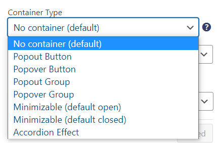
Table of Contents
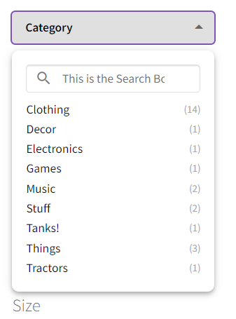
A small box that when clicked on will open up to show all results. The filters underneath will get pushed down.
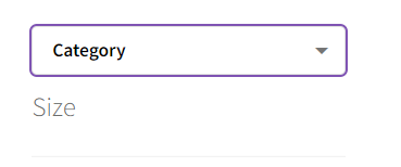
Popout with ‘List Display’ display type:
Once clicked on, this box pops over the screen, turning the rest of the screen slightly gray. Clicking anywhere outside of the popover will close it.
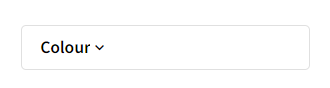
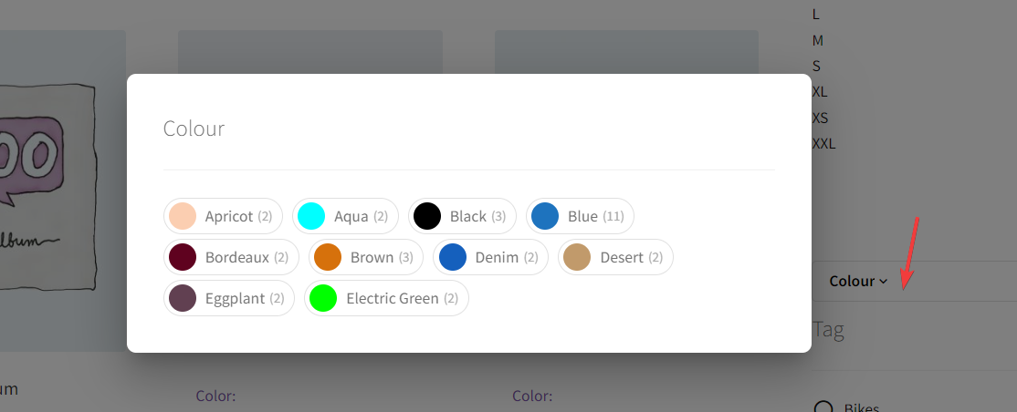
The popover in action with the ‘Colour Label’ Display Type:
Popout Group
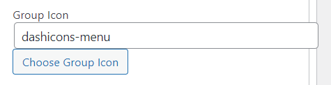
Looks the same as the popout, but in this case, you can group multiple filters together. Set the filters you want in the group all to the ‘Popout Group’ container type. A new option will appear beneath ‘Container Type’ called ‘Group Icon’. Make sure that the filters you set to ‘Popout Group’ have the same group icon.
Popover Group
The same settings apply to this as the ‘Popout Group’ above. Make sure all the filters added to the group have the same group icon.
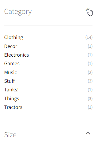
Minimizable (default open/closed)
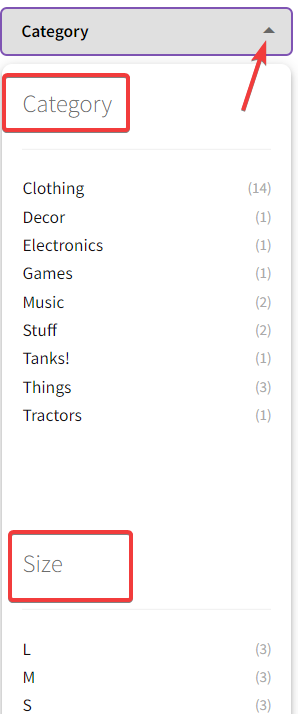
Containers with a little arrow on the side to open or close them. Unlike the accordion effect, which shuts a previous filter when another is selected, these filters get controlled individually. Pick between ‘default open’ or ‘default closed’ to control what the customer first sees on loading the page.
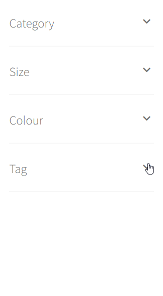
Accordion Effect
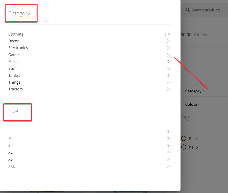
Looks like the ‘Minimizable’ container type, however when one filter is open, and another filter is selected, the previous filter closes.

